Posts

FINAL PRODUCT - Front Cover

Image

Progress Of Magazine

Image
Here I present the development of my magazine and the reasons to why my final magazine differs from my initial plan.

Typography moodboard

Image
I have created a mood board on the different fonts that have been used in a pop music magazine which has helped me differentiate my fonts from other magazines and enable me to experiment with the different fonts that will attract my intended audience.  The font that really attracted me was the XXL magazine font as it was something original and unique also the choice of colours helps make it look attractive and added contrast to the font. The name is very quirky as well and puts off a 'cool' vibe to the magazine just by looking at the name and the font this informs me that you can guess what kind of vibe a magazine may put out to be. This is effective because a font should be bold enough to stand out alone and intrigue a specific target audience.  By doing this mood board it helped me understand the importance of having a different font to other magazines as each aspect of the magazine should cooperate to attract the intended audience.

Artist Profile

Image
I have created an artist profile to help me portray her through my model as she will be representing how the artist is seen within the pop industry. The artist profile helped me a lot as it gave me an idea about the way I should present the artist through the model and how the layout of the magazine will link to the artists music and her persona. Keeping in mind that they way I present the model should be in sync with her profile and her music so it has mentally set me a borderline of what I can use to link her and her music through my magazine and how it will come off to the intended audience.

Flat Plan

Image
Within my post I have included what I have planned out for my magazine to look like and what it should consist of, this is a draft plan as some aspects can change such as the colour scheme but as a whole this plan is what I will be following during the course of making my actual magazine cover and content page. It also features my sketch of what hopefully will look like my actual magazine that has been deconstructed into the reason why I have chosen specific elements.

Shot List

Image
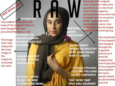
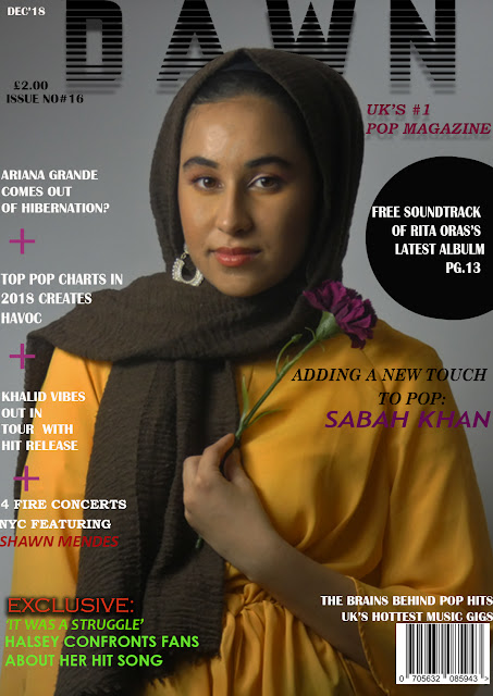
In this post, I have included key shots that I may use in my magazine by playing around with these different shots it gave me an idea of what will make my magazine stand out, the use and purpose of the angle of the shot as well. I also understand the importance of the main image on a magazine as it is the sole feature that will attract the intended audience. This is one of the reasons as to why in the magazine/media industry the point of being unique and different is a key feature to draw the most attention.